David Spriggs

Contemporary artist David Spriggs has, for over a decade now, been mastering his chosen medium for making artwork. Spriggs works heavily with acrylic paint on plastic and ‘His works tread neatly along an unusually blurred frontier between sculpture and painting, greeting viewers with an all encompassing vision that powerfully touches on the ethereal(Starr, 2013).

09. Spriggs 2010 STRATACHROME

Stratachrome, image copyright of the artist.


Sprigg’s work is hugely expansive too, many being made up of hundreds of large sheets of acrylic, layered upon each other and toying with our vision- Stratachrome for example.

Spriggs told Visual News:

My method uses both painting and sculpture. I found that painting had certain qualities that allowed me to represent certain concepts, and sculpture allowed others, yet each method had their own inherent limitations. I wanted to find a way that I could paint in the space between the two and three dimensions in order to bring new ideas and ways of seeing. It lead me to develop a new type of space in which I could represent what I find most fascinating: the notion of the immaterial form.” (Starr, 2013).

14.  Spriggs 2010 VISION_detail

Vision, Image copyright of the artist

Sprigg’s work certainly does play around with how we see it, within each layer his work appears to gain mass and take on a physical, three dimensional form as if it is somehow living within its own confines.

In 1999 I developed an original system of painting onto layers of either transparent film or glass and hanging them specifically through space. I refer to these works as stratachromes, meaning layers of colour. For the last 13 years I have used transparency as an important conceptual device and as a material in my work to explore the relationship between perception, space, the immaterial form, colour, and the symbolism of power. My techniques of making my installation artworks emerged alongside my interest in these subjects and in my practice of painting and sculpture. At the time I developed the first stratchromes, nobody else I knew of had done anything that explored the potential of transparent layering to represent form in space. The closest thing to the layering system was found in science with the cross-sections of the human body project, and in design with the layering process of CNC machines. Robert Rauschenberg and John Cage had made some works with layers of printed glass but these focused on different concepts. The result of my experiments was interesting as I could create ‘immaterial’ forms in new hybrid space between 2 and 3 dimensions. I was excited by the possibilities of the medium and intended from the start to make work on a large scale. It took a lot of testing with materials to develop a system that gave any results, and almost 10 years to reach the large scale I wanted. Each artwork I produce requires very different techniques to achieve the results I want. The technique always follows the subject, the most important element of the work.” (Starr, 2013).

05. Spriggs 2009 AXIS OF POWER

Axis of Power, image copyright of the artist

Although the scale of Sprigg’s work is powerfully humbling it only goes some way in dispelling the sense of delicacy that I was experiencing within my own work in transparency. The outer layers of acrylic act as a container, keeping and stabilising what we perceive to be a three dimensional object in existence, as if it would dispensary should it ever get chance to escape. This use of space plays with the viewers own imagination, we question why the forms are trapped in stasis. We are captivated and unable to look away, we then form the ‘how’s and ‘why’s surrounding the objects but we cannot contain them in stasis. It is our own fault, we maintain our stare at the objects and the longer we do the greater the chance for the object to slip away as we step to the side and ruin the illusion for ourselves.

Check out a video of Sprigg’s work here: https://vimeo.com/19453267


References

Starr, B. (2013) Immersive 3D paintings on layers of transparent film: An interview with artist David Spriggs. Available at: https://www.visualnews.com/2013/09/25/immersive-3d-paintings-layers-transparent-film-interview-artist-david-spriggs/ (Accessed: 30 August 2016).


Transparent Reflections

Having decided that many of the available colour options were not beneficial to the cause of steering my work away from being deemed ‘craft’ I embarked on a quest to find unusually coloured filament.

Eventually I found a clear plastic ABS was available relatively cheaply and decided to try some out with my insect making.

Interestingly I discovered that this colourless filament was much more fluid than the coloured variety which I might imagine has something to do with a lack of pigmentation having an impact on the plastic’s molecular structure. I was familiar with such plastics, having worked with clear acrylic back in my product design days having loved its fibre-optic like nature, drawing the light to its very edges and appearing to light up.

I hadn’t actually settled on making a spider when I started this insect, I’d actually intended to make a Wasp but found that the shape I was making was better suited to becoming a Spider instead.

Once the main body was complete the legs were drawn and ‘welded’ onto the main body. It was at this point that the Spider became less transparent and more translucent do to the various kinks, joins and layered material causing the light to behave differently and the plastic appear translucent.

Now that I had my Spider I needed to do something with it as I was not being content at just letting it be and risk it getting damaged if left in its current, translucent state – an ideal candidate to camouflage into any surface and be sat on!

I remembered that I had a wooden box lurking somewhere in my studio that was waiting to be given purpose. The box had originally started life as a cheap, balsa wood storage box. It was, rather humbly, given a dark and seemingly warm stain during its production that left it to unsuspectingly blend into any atmosphere it was placed.

The storage compartments were removed and the Spider was test fitted in the box where I found that although it contrasted greatly against the box it was totally dwarfed by the box and looked rather limp and pathetic on its own. This seemed rather uncharacteristic of a real world Spider and in continuing my long running investigation into the discomfort of the viewer I set about making a web inside the box. This would serve a two-fold purpose, firstly in making the Spider appear larger and much more threatening whilst also providing an anchor point to secure the spider.

IMG_20160816_171050

I feel that this avenue of investigation has, for the most part, been a success. The subtle tones of the box compliment the clear plastic drawing well and the drawing appears to change depending on how much light is feeding into the box. This results in a drawing of a Spider that can become more or less visible amongst its web depending on not only how much light but also its position in relation to the front of the box. Direct light appears to hide the spider best whereas if the light is coming from an angle the drawing retains some shadow, allowing the viewer to see the Spider. In many ways my latest drawing acts as a sun dial.

Perhaps one aspect in which I was unsuccessful is that my Spider is only very loosely based on a Spider, taking a generalised form. This has resulted in a few cases of viewers being unable to determine just what the mass of plastic they are looking is meant to be. One such comment I received was “Spider? It looks like a whale or Zeppelin”. So perhaps a more refined and more considered approach should be taken when making my insects, a closer attention to detail may resolve this. That being said, the mental image of a tiny Airship in a box is quite amusing!


I do feel that I will further investigate the use of transparent/translucent plastic in my drawing. There is a quality about such material and the way it catches the light that is entirely mesmerising as David Geary explains:

“The attraction of transparent material is that it appeals to us on different levels simultaneously. To illustrate the character of transparency in a general way, let us imagine we have before us a large crystal of clear quartz. It appeals to our sensual nature with its fragility, its sparkling light-flooded quality and elemental clarity of colour, as in Topaz, Amethyst or Rose Quartz. It appeals to our intellectual and spiritual side with its mysterious or paradoxical effects, it seems both substantial and insubstantial. It refracts and reflects light at the same time. It contains change, uncertainty, and yet clarity. Because it so engages our perceptions, a crystal can address our imagination in special ways that no opaque material can” (Geary, 2006).

It is the qualities Geary describes that I see within my own transparent sculpture; it almost appears to be both solid and liquid at the same time, as if the outer layer is solid but the inner layer has yet to settle and take on a solid form. In this respect it appears to give life to my work. The ‘sparkling’ nature of the material not only highlights the delicacy of my drawing but also appears to add a sense of movement, as if the spider is actually breathing. The lack of colour appears to provide a clarity in my work when seen in the correct lighting conditions.

20160816_170706

I did see how the drawing changed when the door of the box is opened. This appears much more confrontational to viewers but also happens to make the box feel smaller at the same time. As Bachelard deduced, a closed chest holds more than an open one.

Until next time.

Larry


References

Geary, D. (2006) Transparency in Art. Available at: http://crawl.prod.proquest.com.s3.amazonaws.com/fpcache/edf52607144e00c0f15e6a3ac351318b.pdf?AWSAccessKeyId=AKIAJF7V7KNV2KKY2NUQ&Expires=1472561987&Signature=oRMIr9nt3qgaj6OkoQGXlOvvHDo%3D (Accessed: 30 August 2016).

A Family Collaboration

Whilst at my Grandmother’s house I was admiring some art she and my (quite frankly adorable) cousin had been making. I couldn’t help but notice that one in particular looked like a beetle and thought it was a good opportunity to transform what I was seeing into a 3D printed drawing.

14011959_1056057424442736_411052379_n

I printed out a photograph of the original drawing at the same scale as the original and cut it out, using it as a template to form my 3D bug around. Once a simple exo-skeleton was built around the drawing it was then cocooned in layer upon layer of plastic filament until I was satisfied that it was complete. Legs and extra detailing, such as a darker colouring to help define different sections of the shell, were then added. The legs are admittedly painted black as I’d ran out but this was more an exploration to see if I could transform the drawing, there is still room for refinement on my part, quite frankly I could learn a thing or two from my cousin!

14034821_752663411539845_1000416668973920578_n

I guess you could say that this was an opportunistic collaboration, had I not seen the painting at my grandmother’s then this insect would not be. Perhaps the moral of the story here is to visit your grandparents more often!

I have seen a few examples of collaborative works between adults and children but the relationship has usually been parent and child; such as Ruth Oosterman or Dave Devries  – I’ve not yet come across another Grandmother, Grandson and Cousin collaboration as of yet!

If we may not turn to look at my actions in this act of cocooning a child’s painting we see that my drawing mirrors our natural instincts as adults to protect and defend children. Of course, I say adult and child rather than make reference to paternal and maternal instincts, as I have no first hand experience at either due to not having children of my own – so who am I to throw such words about such haphazardly!

The hard outer shell of the beetle protects the painting contained inside, art mirrors life in the sense that the outer shell of a beetle keeps its soft innards safe – and without blowing my own trumpet, seasoned artist is protecting art of the purest form.

If, as Edgar H. Schein says, artists are ” to help the rest of us see more, to broaden our perspectives, and to get in touch with both internal and external forces that we might otherwise not notice”(Schein, 2001) then we must also consider that my cousin could one day be responsible for the future of fine art as we know it and that “All children are in a rapid state of mental growth.  They are learning so much faster than adults can and although an adult may see rough scribbles on the paper, that child could have had a major breakthrough in emotional color theory”(Woodward, 2010). 

This, then, is a practice that should long continue, activities such as painting and drawing for young children and also that we, as fully developed adults, encourage and protect this important stage of our children’s development.

I’m certain that my cousin is well on the way to becoming a genius!

Larry


References

Schein, E.H. (2001) ‘The Role of Art and the Artist’, Research Gate. Available at: https://www.researchgate.net/profile/Edgar_Schein/publication/247712925_The_Role_of_Art_and_the_Artist/links/53fe2adc0cf21edafd1508a5.pdf (Accessed: 24 August 2016)

Woodward, R. (2010) Advice for parents with artistic children. Available at: http://ryanwoodwardart.com/info/advice-for-parents-with-artistic-children/ (Accessed: 24 August 2016).

Julie K Holt Walsh

I recently visited Ordsall Hall, Salford, to see ‘Ordering the Chaos‘ by Julie K Holt Walsh.

Fascinated by natural objects discarded by nature, which land randomly on the ground. Walsh collects seeds, insects and other organic objects and arranges them carefully and systematically into groups, creating order from the chaos(Salford Community Leisure, 2016).

The show was an exhibition of natural, harmless objects given a new and playfully dark role; their purpose seemingly reinvented, seed pods become the heads of carnivorous plants desperate to escape their confines, thorn-studded rose branches become a prison, bird skulls become masks reminiscent of African tribal masks under witness to unexplained rituals. We are transported to another world.

Perhaps this reinvention of objects stems form Walsh’s continual questioning of definitions and her keenness to understand art through the eyes of her students, some of whom have testimonials on her website.

The re-use of the natural was a theme that continued within the exhibition space, the natural forms of Walsh’s work, coupled with the minimalist qualities of the restored Hall building were a striking contrast to the white gallery walls and man made elements of the artwork.

In using objects of nature in her work Walsh does seem to leave an overriding sense of emptiness in her work, despite filling the exhibition space one cannot help but feel that they are but empty vessels – perhaps best evidenced in the empty seed pods. This could perhaps be linked to issues of family tragedy and childbirth which have been the driving force behind Walsh’s studio practice for many years.

Larry


References

Salford Community Leisure (2016) Exhibitions. Available at: http://www.salfordcommunityleisure.co.uk/culture/ordsall-hall/exhibitions (Accessed: 23 August 2016).

Rachel Goldsmith

Whilst undertaking my sporadic and inconsistently timed survey of what was happening in my own field of work I was genuinely humbled and awestruck when I stumbled upon the work of Rachel Goldsmith, a New York based artist who works predominantly with a 3D printing pen. Yes, Rachel is also well versed in water based paint and ink but her career skyrocketed through her work with the 3Doodler 3D printing pen, even being commissioned by 3Doodler themselves to produce work for the MoMA design store (Goldsmith, 2012) and is now featured on the company’s artist blog –  Rachel is perhaps the ‘go to’ person when it comes to 3D printer pen art.

Image copyright of Rachel Goldsmith

3Dprint.com‘s Hannah Rose Mendoza was also impressed with Goldsmith’s work as far back as 2014, writing:

Goldsmith’s work takes sketch and pattern making in a beautiful direction and her facility with the medium is clear as she changes the textures and tensions of the strands of quickly hardening plastic while making them look organic and naturally generated(Mendoza, 2014).

Goldsmith is so at ease with the 3Doodler pen that not only the forms she produces appear organic but the material too! I must admit that I was genuinely speechless at seeing Goldsmith’s work and for some time feared that I would never be able to write this post for not knowing what to say.

Image copyright of Rachel Goldsmith

Goldsmith’s control of her pen is now developed to such a level that she is now defining the future of painting, vivid coloured plastic strands are masterfully forged into shapes of almost organic nature with such ease that it is impossible to comprehend how such an object can come into being. Goldsmith manages to create objects that suggest a flow of movement from something so categorically man-made – every piece seems to flow and carry movement.

Image copyright of Rachel Goldsmith


Aware of her influential status, the first lady of 3D printing is leaving no stone un-turned in her exploration of the capabilities and limits of her pen:

“Not only is this still a relatively new medium, but I’m at the cusp of the wave in utilizing it in general, as well as in fine art specifically. I have spent the last few years experimenting, developing and now refining an arsenal of techniques that I can employ to create fine art. I’ve been using a technique a lot which I call “Anchor Pull”. This is when I use the pen to make an anchor, and then drag the melted plastic to create long webs in layers. You can see this in my Kelp series, my Webs, and my Squares series, as well as my more recent Triangles” (Matisons, 2016). 

Goldsmith is even bringing in ‘foreign elements’ to the 3D printing technique, elements that cannot be made with the printer pen alone such as recolouring the plastic with spray paint or goldleaf in order to fully exploit the materiality of the 3D printing medium and deepening the territory in which it encroaches. Such experiments have also seen her paintings come full circle with 3D printed elements inhabiting the canvas space in which they had been freed from with the creation of the 3Doodler pen.

Image copyright Rachel Goldsmith

Goldsmith told 3Dprint.com’s Clare Scott:

the art world needs to embrace the endless possibilities that this new technology presents. Amazing creations are coming down the pipe line and I have no doubt that new ideas will continue to pop-up. I have been crusading for the understanding that the 3Doodler can and should be used for Fine Art (#3Doodler4FineArt)… and my conversation with President Clinton along with my observations of the tool in the hand of other artists reaffirms my belief. Although some contemporary art galleries have already opened their doors to this new medium, I am hopeful that many more will follow suit” (Scott, 2016).

Goldsmith has created the hashtag #3Doodler4FineArt so that other 3D printer pen artists may share ideas and work.

I, for one, cannot wait to see more of Goldsmith’s work!

https://www.facebook.com/artistrachelgoldsmith/

Larry


References

Goldsmith, R. (2012) Bio & CV « Rachel Goldsmith. Available at: http://rachelgoldsmith.com/bio/ (Accessed: 20 August 2016).

Matisons, M. (2016) Rachel Goldsmith makes fine art by ‘painting in plastic’ using her 3Doodler. Available at: https://3dprint.com/131239/rachel-goldsmith-fine-art/ (Accessed: 20 August 2016).

Mendoza, H.R. (2014) Rachel Goldsmith: Artist in 3Doodler. Available at: https://3dprint.com/29174/rachel-goldsmith-3doodler-art/ (Accessed: 20 August 2016).

Scott, C. (2015) Artist Rachel Goldsmith continues to take 3Doodler 3D printing pen to new levels. Available at: https://3dprint.com/103279/goldsmith-3doodled-flower/ (Accessed: 20 August 2016).

Mima (Middlesbrough Institute of Modern Art)

A recent visit to Middlesbrough saw a return to an old stomping ground in MIMA, Middlesbrough Institute of Modern Art. This was my first visit to the gallery since 2013 and, more importantly, since the day-to-day running of the gallery was transferred from the local council to Teesside University.


Teesside World Exposition of Art and Technology


I was pleased to discover that on ‘surface level’ the gallery seems very much the same, the main gallery space was occupied with an exhibition entitled ‘Teesside World Exposition of Art and Technology‘ . This exhibition occupied all four rooms of the ground floor gallery space and is “an urgent reaction to the recent closure of Redcar’s steelworks and a bid to make a positive contribution to the future of industry in the North East region” (MIMA, 2016).

Each of the gallery spaces is interlinked, documenting the history of the regions industrial landscape and heritage from the mid-nineteenth century to present day and features the work of Aikaterini Gegisian, Adrián Melis, David Mulholland, David Watson, Eva Fàbregas, Farid Rasulov, Goldin+Senneby, Hackney Flashers, Mikhail Karikis, MVRD, Norman Appleton, Philip Boville and Len Tabner.

I found that the most effective way to view the exhibition was in reverse going through Gallery 1, 4, 3, 2 and finally back to 1.

‘Gallery 4’ centres around the industrial heritage of the North East, in particular steel making, and is highly charged with political pieces that are still sore from the recent steelworks closure. They are emotive and totally succeed in pulling on the heart strings of the viewer, one cannot help feeling as though they have also suffered loss through the demise of the industry.

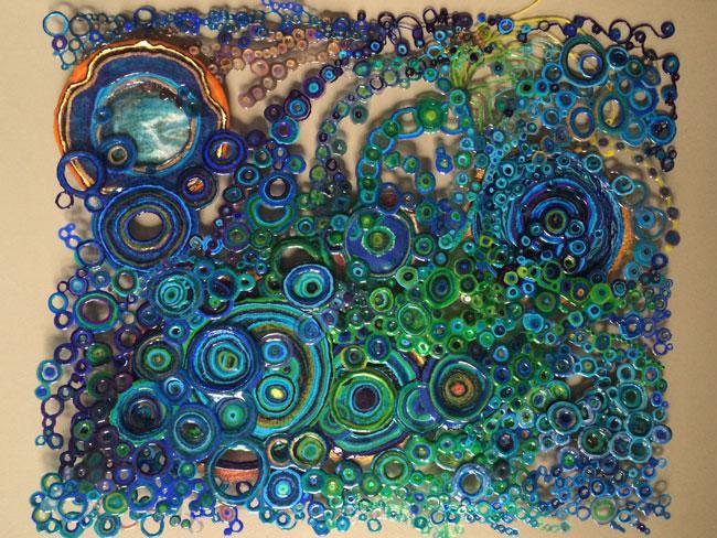
‘Gallery 3’ takes this suffering and magnifies it onto a global scale, here issues of mass production, mass consumption, inequality, human rights, gender equality, pay gaps and corporate mentality are explored. The piece that stands out here is ‘Gem Machine‘ (2016) by ‘Unknown Fields‘, or rather the accompanying sculptural piece (pictured in the image cluster at the top of the page) to the video which is a visualisation of the financial gap between “poorly paid labour and the luxury market” (MIMA 2016). A handful of rice grain, representative of the daily quantity of rice consumed by labourers in the jewellery mining process, have been subjected to extreme heat and pressure and lay heaped around a single golden (and elevated) jewel. This piece is perhaps the most humbling of all in this exhibition, we are reminded just how much we have and how unfair the world actually is. Suddenly we are sheepishly shamed about our daily groans and our lives slide into perspective.

‘Gallery 2’ presents a collection of historical documentation, mostly on fairly positive subjects such as creation of ports, industries and times of expansion.

This brings us swiftly back to ‘Gallery 1’ which plays host to the regions current developments in science, technology and education. I feel it is much better to have experienced this exhibition in reverse, to be outward looking. To view the exhibition in the intended order would see us look out to the suffering on the global scale only to brush it aside in favour of suffering closer to home on an arguably (and perhaps controversial to say so) lesser scale.


The Office of Useful Art

20160807_134054.jpg

“Developed in collaboration with artist Tania Bruguera, the Van Abbemuseum and the Internationale confederation of European museums as part of the Uses of Art programme funded by the European Culturefund and Arts Council England” (MIMA, 2015), ‘The Office of Useful Art‘ plays host to ‘The Arte Útil archive’. It is not an exhibition but rather a working space for the public to make art for social change.

It was interesting to note that this particular display of public interaction centred around the recent EU referendum. Surprisingly for a town that voted 65.5% to leave the EU the rhetoric in this political installation was undeniably on the side of remain and sought to shine light on the false truths promised by ‘Leave’ campaigners. This also links to the closure of the steelworks and the feeling of abandonment felt by the electorate in the region.


If All Relations Were to Reach Equilibrium, Then This Building Would Dissolve

If All Relations Were to Reach Equilibrium, Then This Building Would Dissolve explores the tension between free circulation and border control as well as the experience of exile and displacement, and focuses on human rights, governmental policies, xenophobia, identity, and trauma, among other themes” (MIMA, 2016).

I did find this particular exhibition to be the most alarming, it highlights the high level of xenophobia, racism and euro scepticism in one of the areas the benefited most from being in the European Union. New buildings for School’s and Universities in Teesside have been funded through the EU alongside redevelopment of town centres that Downing Street has long forgotten (Blackburn, 2016).

Figures show that Teesside was due to receive £162m in EU funding between 2014 and 2020 (as the third highest beneficiary of the UK’s EU funding behind Cornwall and Wales)   (Ellis, 2016) which might have proved vital to future generations of Teessider’s who have been unable to see past the end of their noses due to sensationalised tales of an impending migrant crisis, a high case of regional self entitlement and the trend of gutless politicians shifting blame onto others in what I shall call scapegoat-ism. 

The exhibition’s title is a piece by Gillick, a text he originally proposed as part of his commission for the Home Office’s new London headquarters in the early 2000s. According to the organisation’s website, the Home Office is the government department responsible for immigration, counter-terrorism, police, drugs policy and related science and research. Gillick’s expression suggests that in a world in which all people are truly equal, or at least treated equally, the Home Office would not need to exist” (MIMA, 2016).


Centre for Social Making: Middlesbrough Collection display

20160807_135041

The Middlesbrough Collection display is a bringing together of art, design and craft with a holistic view and encouragement for social use as learning tools.

The Middlesbrough Collection was inherited from the former Cleveland Crafts Centre, Cleveland Gallery and Middlesbrough Art Gallery. It holds approximately 2,250 works from around 1900 to the present time, with strengths in post–Second World War British and international drawing, twentieth-century British ceramics and contemporary international jewellery” (MIMA, 2016).


The Caravan Gallery: Jan Williams & Chris Teasdale

20160807_135932

extra{ordinary} is an exhibition featuring a collection of photographs taken across the country over the last fifteen years. These works capture the extraordinary ‘reality and surreality’ of the way people live in contemporary Britain” (MIMA, 2016).

In many ways, this particular exhibition reveals the grotty reality of life in present day Britain and dispenses with the ideals we are presented with in glossy magazines and fairy tales.


I felt that each of the exhibitions gelled well together and told a complete story as one journeyed through the entire gallery, this was much more noticeable with the gallery under its new custodians than it was under any of my last visits, I look forward to returning.

Larry


References

Art Rabbit (2016) Teesside world exposition of art and technology. Available at: https://www.artrabbit.com/events/teesside-world-exposition-of-art-and-technology (Accessed: 20 August 2016).

Blackburn, M. (2016) Would Teesside be better off if the UK stays in Europe or leaves? Available at: http://www.gazettelive.co.uk/news/teesside-news/would-teesside-better-out-europe-11505345 (Accessed: 20 August 2016).

Ellis, M. (2016) How much EU funding could Teesside lose after Brexit? Available at: http://www.gazettelive.co.uk/news/teesside-news/teesside-could-lose-tens-millions-11568964 (Accessed: 20 August 2016).

MIMA (2016) Teesside world exposition of art and technology – mima – welcome to mima – mima – welcome to mima. Available at: http://www.visitmima.com/whats-on/single/teesside-world-exposition-of-art-and-technology/ (Accessed: 20 August 2016).

MIMA (2016) If all relations were to reach equilibrium, then this building would dissolve – mima – welcome to mima – mima – welcome to mima. Available at: http://www.visitmima.com/whats-on/single/if-all-relationships-were-to-reach-equilibrium-then-this-building-would-dissolve/ (Accessed: 20 August 2016).

MIMA (2015) The office of useful art – mima – welcome to mima – mima – welcome to mima. Available at: http://www.visitmima.com/whats-on/single/project-space-1-the-office-of-useful-art/ (Accessed: 20 August 2016).

MIMA (2016) Centre for social making: Middlesbrough collection display – mima – welcome to mima – mima – welcome to mima. Available at: http://www.visitmima.com/whats-on/single/centre-for-social-making-middlesbrough-collection-display/ (Accessed: 20 August 2016).

MIMA (2016) The caravan gallery: Jan Williams & Chris Teasdale – mima – welcome to mima – mima – welcome to mima. Available at: http://www.visitmima.com/whats-on/single/the-caravan-gallery-jan-williams-chris-teasdale/ (Accessed: 20 August 2016).

In the Garden – Miniature Art

Following on from my bridge for mini-beasts I decided to add to this new world I had created and made a flag pole as a marker for the “summit” that the bugs would have had to climb. This was purely an excuse for me to return to the world of the miniature and inhabit the world I had previously discussed once more.

I was eager to learn more about miniature art and find others who were making tiny works of art.

Miniature art, I discovered, has had a long history that “spans centuries of tradition in various cultures and civilisations around the world. A recent focus in the arts of Asia has put miniature art from South Asia on the global contemporary art map, reintroducing the age-old medium through a re-interpretation, re-elaboration and revival in the work of internationally acclaimed artists such as Imran Qureshi, Aisha Khalid, Shahzia Sikander and Rashid Rana, among others(Xuan Mai Ardia, 2014).

Many, such as Shahzia Sikander, who are currently exploring this subject aim to “expand the medium from within, embracing its craft, technique, rigour, detail and small scale, as well as its historical contexts” (Desai, 2013). 

I have noticed a particular surge in the interest of the miniature, particularly with miniature food, the desire for us to escape our world and into a world reminiscent of cherished childhood memories and play kitchens. Perhaps we have grown tired with technology and the simplistic elements of the play kitchen provide an escape to our smartphones and computer games.

Miniature art does have its practical uses too, particularly with drawings and paintings. The smaller size makes them much more transportable and therefore affordable – size also enables a collector to display more pieces.

What inspires others to use the miniature in their art I wonder, artist Matthew Albanese revealed to The Creators Project:

My obsession with miniatures began at a young age. Playing with toys, action figures, and miniature replicas was an early vehicle to unlocking my imagination. It always seemed to me that the miniature was the most effective solution to experiencing visions of worlds and new perspectives that otherwise could not be achieved in life. As a photographer my dioramas are simply a means to an end. They give me the ultimate ability to control my environments while satisfying a need to simply work with my hands. I approach my work with a final vision of a photographic landscape. Capturing moments of atmosphere, light, and perspective, my images become an orchestrated series of miniature events that culminate through the lens of my camera, deceptively evoking the sublime forces of Mother Nature.” (Chung, 2015).

Immediately Albanese cites his childhood experiences and the miniature worlds he inhabited during childhood play as the backbone for his current artistic practice and it seems for many that the miniatures role in finding the ‘self’ is what draws them to it, as Kendal Murray explains:

My work with miniatures came from my interest in the role fantasy plays in the creation of the ‘self,’ in psychological experiences such as memory and dreaming, and the different ways those experiences are embodied and given meaning. The miniature is used as a metaphor for our inner lives where fantasies of “selfhood” are enacted through dream-like situations. The dream externalized in the form of a miniature. We long to explore worlds represented in miniature, but are denied physical access. So we project ourselves into those scenarios, identifying with the personalities of the tiny characters, reading the implied relationships between each of the characters and investing our own desires, into the pleasurable outcomes of the stories being told“(Chung, 2015).

Murray sums up, much better than I had previously, the true role of the miniature whilst drawing several similarities with Bachelard. Much like the miniature kitchen, we can go further and further into putting ourselves into that scenario but we will never truly be able to inhabit it on a long term. We cling desperately onto that world for as long as we can.

With this in mind is it then possible that the flag pole is a projection of my own desire? Am I responding to a previous projection into the ‘mountain peaks’ of that dry stone walling? Upon my last successful climb did I demand that a flag be erected in honour of my achievement?

I am truly fascinated with the subject of the miniature and will continue to research and reflect.

Until next time,

Larry.


References

Chung, B. (2015) Miniature artists explain why they love making Tiny Worlds. Available at: http://thecreatorsproject.vice.com/en_uk/blog/miniature-artists-explain-why-they-make-tiny-worlds (Accessed: 19 August 2016).

Desai, V.N. (2013) Intertwined identities: Shahzia Sikander in conversation with Vishakha N. Desai. Available at: http://artasiapacific.com/Magazine/85/IntertwinedIdentities (Accessed: 19 August 2016).

Xuan Mai Ardia, C.A. (2014) Art in a suitcase: Is miniature art becoming a new trend? Available at: http://artradarjournal.com/2014/09/12/art-in-a-suitcase-is-miniature-art-becoming-a-new-trend/ (Accessed: 19 August 2016).

(Not quite) In the Studio – Lilliputian Hallucinations

Whilst holidaying in the Lake District I took the opportunity to continue to make work with my 3D printer pen, I had only expected that I would be making quick, disposable pieces on a worktop in the kitchen and that my only observations would be on the change of my studio space. Little did I know that I would be fortunate enough to be staying in a cottage with a garden that would seamlessly blend into the stunning environment and rolling hills.

It was after a brief exploration of the garden than I decided that I would make work for the outdoor environment, but what? I was rather taken by the dry stone walling that separated the garden from field and fell, and on closer inspection could see that stones became mountainous peaks separated by deep, moss sewn valleys. I decided that I would create a bridge to aid mini beasts cross the “mountains”.

20160801_194238

I had a vague idea in my head of what I wanted to do, combine nature with the man-made, I wanted to support sticks and twigs with towers made with my pen. I set to work and found a stick that I would incorporate into my bridge and built supports with my 3D printer pen but I found this arrangement to be quite unstable and built further supports.

20160801_200154

I soon found that this method was rather fragile and a further stick was added to aid in supporting the structure and a suitable valley in the stone walling was located. I also felt that whilst the bridge did its intended job it was lacking in any aesthetic flourish and as you can see from the image below, the bridge was complete.

20160801_202137 (2)

But what is the point of all this? What have I achieved? Displaying the work outdoors “juxtaposes claustrphobia and agoraphobia“(Bachelard, 2014), it challenges societies increasingly introverted and ever dwindling social interactions and pushes the image to the limits of what we thought imaginable.

In the realms of the outdoors we, as viewers, are unsettled; there are many more distractions, many more ways of enticing away concentration. In ‘The Poetics of Space‘ Bachelard comments on the relationship between the inside versus the outside:

Outside and inside form a dialectic of division, the obvious geometry of which blinds us as soon as we bring it into play in metaphorical domains. It has the sharpness of the dialectics of ‘yes’ and ‘no’, which decides everything” (Bachelard, 2014).

This division is painfully obvious when we compare how my bridge translates into a gallery environment. The void-like dullness of the gallery surround eats away at our distracting thoughts and numbs our concentration so that we can and only focus on the objects that break up the nothingness. As you can see from the image below the bridge in a gallery environment has no life about it, yes the sketch like nature of construction appears to be more animated when set against the plain backdrop of the gallery wall but the whole object feels lifeless in the same way that preserved vehicles sit static in museums – a shell of what once was.

IMG_20160816_171551

Taking the bridge into the outdoors and into the context for which it was made, the miniature, allows the art to fulfil one of its primary functions, enabling the viewer to make their own personal connections with what they are seeing. It is “in this ambigous space, the mind has lost its geometrical homeland and the spirit is drifting“(Bachelard, 2014). Art is supposed to provoke thought and trigger memories, removing the “cell” of the gallery environment here allows those connections to be made but it should be asked where does the spirit drift to?

I like to think that in this moment we are carried off on a daydream to rekindle childhood fantasy, encouraged by the context of the miniature (the bridge for mini beasts), we imagine that we are in scale with those surroundings. Of daydreams Bachelard says:

Daydreams of this sort are invitations to verticality, pauses in the narrative during which the reader is invited to dream. They are very pure, since they have no use. They must also be distinguished from the fairy-tale convention in which a dwarf hides behind a head of lettuce to lay traps for the hero“(Bachelard, 2014).

Bachelard attaches connotations of purity to daydreams, a safe place in which we can escape our daily routines and bustle and can return to relive better days, albeit momentarily. Here in this daydream rational thought is suspended and our imagination is allowed out to play having being restrained and suppressed by the bores of adulthood. With this rediscovered vision we are able to see ourselves within the environment of the bridge and mini-beast, in our mind we become to scale with it and the world in which it has created for itself in a sort of “Lilliputian hallucination”(Bachelard, 2014).

The miniature is covered in great depth by Bachelard as a sourse of refuge, “The minuscule, a narrow gate, opens up an entire world. The details of a thing can be the sign of a new world which , like, all worlds, contains the attributes of greatness. Miniature is one of the refuges of greatness“(Bachelard, 2014). The miniature then, seeks to wipe us clean upon entry as if to make us fit for this temporary roost in the new world, returning us to childhood innocence. “Miniature rests us without ever putting us to sleep. Here the imagination is both vigilant and content”(Bachelard, 2014). The miniature, as Bachelard suggests, “detached me from the surrounding world, and helps me to resist dissolution of the surrounding atmosphere”(Bachelard, 2014); taking on the role of a guardian or nanny, making sure we are fully recovered and rested, washing us clean and preparing us for our return to rational thought and adulthood but always careful to leave imprints in the deepest of memories that entice us back every once in a while.

It is also worthy of note that the visual sense is not the only way of accessing the world of the miniature:

The casuality of smallness stirs all our senses, and an interesting study could be undertaken of the ‘miniatures’ that appeal to each sense. For the sense of taste or smell, the problem might be even more interesting than for the sense of vision, since sight curtails the dramas it witnesses. But a whiff of perfume, or even the slightest odour, can create an entire environment in the world of imagination” (Bachelard, 2014).

Bachelard’s suggestion that the other senses could prove much more prosperous territory to explore is certainly an interesting avenue yet to be explored. We have already seen this touched upon in places such as ‘Dans le Noir?’, a ‘blind restaurant’ that suppresses the sense of sight to bring an entirely different eating experience but we have yet to really see other sensory play used in the search to return to the miniature.

It is, of course, worth asking if this quest to find means to the accessing the childhood memories of multiple strangers is a fools errand. The likelihood of many people sharing a common trigger is highly unlikely due to the fact we are all individual and have individual experiences but also we must remember that these memories fade quickly, dissipating into a fine mist.

20160801_202128

So my bridge, through the creation of a miniature object I have managed to trigger childhood memories of fairy-tale endeavours and re imagine myself in miniature in the world in which my bridge has created. The use of the outdoors helps to root the believably of the fairy tale and coax us deeper into the world of the miniature. We are temporarily removed from our usual world, through childhood imagination we complete a herculean trail before we are rested, dusted off and returned to the normality or rational thought with a refreshed outlook on the rational. We see things differently upon our return to the rational, a temporary hum of our childhood selves lingers within us, an optimistic mood, a smile, a laugh. And finally, if I may leave you with part of a poem by Noël Bureau (as quoted by Bachelard and translated into English:

“He lay down behind the blade of grass

To enlarge the sky” (Bachelard, 2014).


References

Bachelard, G. (2014) The Poetics of space. London, United Kingdom: Penguin Group (USA).

Hawkshead Grammar School

Whilst in the Lake District I took the opportunity to visit the Hawkshead Grammar School Museum, the museum is located in the Old Grammar School building in the village of Hawkshead, Cumbria, and houses a unique collection of historic artefacts relating to the ancient School, some of which date back to the sixteenth century. Famous attendees of the school include William Wordsworth, whose name has been carved into a desk – though impossible to say wether or not he did the carving.

The museum is definitely worth a visit, the staff are incredibly helpful and informative and the desks alone provide a wealth of artistic interest for any photographer.

The museum is bright and open despite the deceptively small appearance of the building and visitors are given almost free reign to explore.

DSCF5666.JPG

Wordsworth’s name carved into a desk.

The museum is open 1st April – 31st September, 10:30 am – 1pm and then 1:30pm-5pm.

Work, work, work?

Hello, me again! Here’s a quick look at what has been happening ‘behind the scenes’ in my practice.

Holybobs

My presence in my studio was somewhat halted recently due to a well earned and greatly appreciated holiday in the Lake District. I didn’t stop working however! I was dutifully armed with Oliver Grau’s ‘MEDIAARTHISTORIES’, Gaston Bachelard’s ‘Poetics of Space‘and Tom Rolt’s ‘Railway Adventure‘ – the latter being my escape from the art theory! As you can see below I was also armed with my camera and, as a later blog post will show, my 3D printer pen.

Whilst in the Lakes I did keep an eye on the region’s local galleries noting that the tourist market was obviously their biggest seller. The area is saturated with lakeside paintings and photographs, separated by minuscule differences in the progress of boat a boat’s journey across a lake. This succeeded in creating a sense of déjà vu whenever you stepped foot in a gallery which I found most off putting and by the end of the week had not bothered to step foot in one gallery after seeing more of the same in the window display. I did wonder wether it was possible to assemble a stop motion film through documenting the repetitive nature of the work.

Saying that, however, there were some galleries I had found that shifted focus from photography and painting to small sculptural pieces and I did overall find the change in subject matter a welcome change from the national commercial galleries and their current flooding of a select few artists onto the market. One can also not deny that the Go Herwick lamb trail is a great bit of fun and reminiscent of Liverpool’s ‘Superlambananas‘!


Artist Vs Technology

As mentioned in a previous post, I had been trying to find some decent (and free) video editing software in order to show the 3D drawing process with my web. I thought I had found the answer with ‘Wondershare Filmora‘, it has an unrivalled library of effects and options for free software but it was only when I came to export my video that I discovered the downside. My video was hidden behind the largest watermark I have ever seen! The effects I had been so keen on were no longer the key element of my video.

fail1

I searched around for alternatives and eventually settled on VSDC video editor. Whilst this program doesn’t have the same extensive effect library in its free version it does allow for exporting video without a watermark and allows greater freedom to edit your video, working in much the same way as Photoshop.

Watching the footage back I did rather grimace and had thought the footage to be at all flattering, it was therefore important to me to disguise myself as best I could and draw more attention to the movement of the drawing.

fail2

Basic black and white filter.

The basic black and white filter certainly removed a lot of the distracting elements in the film. I tried various ways of editing the film, some are pictured below.

fail3

Low contrast.


fail4

Not entirely sure what is going on here…

fail5

Motion blur edit.

I eventually found the ‘motion blur’ effect which, in the film, now appeared to be dragging myself into the corner of the image, as if I too was part of my web. I set about really playing of this effect and increased the contrast before deciding that I was completely satisfied.

fail6

Final film still.


Exercise in Social Media

WordPress

So what’s happened with the online side of my practice since my last update? I’m finding wordpress so easy to use now, in many ways it has almost become my sketchbook – documenting my thought progression.

Facebook

Facebook is constantly providing data on the performance of my art page, seeming to suggest that overall page views are down 67% since 18th July and likes have also slowed down for the minute.

My post reach and engagement are on the up, as can be seen from the data below. My total video views are at 432 which isn’t bad either when considering I only have three videos!

data1

data2

Another element of facebook’s feedback element is the ability to determine from what platform people are viewing my page. As you can see from the chart below most people are using mobile devices which is one reason I suspect that my mini essay style blog posts are performing at substandard levels, people do not want to be redirected away from the social media platform. Another reason being that the vast majority of my page likes are friends, friends who have better things to do than endure some art theory!

I did have a bit of a panic after my review of Martin Creed / Dub Vampire / Moderate Realism / Sally Gilford after receiving likes Dub Vampire’s facebook page and then likes from front man of Dub Vampire, Brian Turner! At last my page is being liked by outsiders to my own social circle.

data4

Twitter

I am feeling comfortable with Twitter, it seems to be where my essay posts are more greatly appreciated for now. In an effort to streamline my social media posts, after finding that my posts between facebook and twitter were greatly different, I have enabled my facebook to share what I post there to my twitter account too. Whilst this is great it does also mean that blog posts from wordpress are shared twice to my twitter. I will have to work on this.

Instagram

I have really started to use my Instagram app on my phone, unfortunately only for editing photo and video. I have yet to really engage in its social media aspect.

Portfolio Website

I expect that this week I will take the plunge and get a nice portfolio website set up (as opposed to a ‘orible one). Having spent a long time looking and deciding just what I want I feel that now I am able to proceed further.


The Learning Curve

I did recently receive the news that a commission I had put many hours work into was no longer wanted. Understandably I was disappointed and not at all happy, having just lost out on a nice bit of money that I was rather relying on earning.

Undeniably the loss of money could have been prevented if I were better prepared but as they say, we learn by doing.

In future commissions from myself will require a down-payment before work is started in order to cover material costs and ensure the project is followed through.

I will also charge by the hour for my efforts.

A final charge for the finished piece will also be added (this probably applies more to copyright for design work).


I think that is all for now, expect more updates this week!

Larry